


Welcome to the world of color psychology in beauty branding! I am excited to share tips and techniques on leveraging this science to create innovative and effective beauty brand strategies. We all know that colors can evoke emotional responses, but do you know they can also influence purchasing decisions? In today’s highly competitive market, understanding the role of color in consumer behavior is essential for any successful beauty brand.
This article will explore how consumers perceive colors and how they impact their perception of beauty products. From bold hues to more subtle shades, we will examine how various color combinations can elicit specific emotions and associations. Additionally, we will delve into the importance of color consistency across all touchpoints – from packaging design to social media campaigns – to build a strong brand identity. So let’s dive into the fascinating world of color psychology and discover how it can elevate your beauty brand strategy!
The Role Of Color Psychology In Consumer Behavior
Color theory is an essential aspect of beauty branding. Understanding the role of color in the consumer behavior can help brands create more effective marketing tactics. Colors evoke different emotions and feelings, influencing a customer’s purchasing decision.
For instance, red increases heart rate and stimulates appetite, making it an ideal color for food packaging. Yellow is associated with happiness and warmth, while blue evokes trust and reliability. Companies can build stronger connections with their target audience by strategically choosing colors that align with their brand values and message.
Moreover, studies have shown that using specific color combinations can improve brand recognition by up to 80%. This means that selecting the right color scheme can make or break a company’s success in the market. Brands should also consider cultural differences when developing their visual identity since certain shades may carry distinct meanings across different regions.
Understanding how color affects consumer behavior is crucial for any business looking to stand out in a crowded marketplace. By incorporating color psychology into your branding strategy, you can create a unique image and connect with customers on a deeper level without explicitly stating your product benefits.
Different Colors And Their Perceived Meanings
Picture this: you’re strolling down the aisles of your favorite beauty store, taking in all the colors and products that catch your eye. As you scan each shelf, have you ever considered why certain shades make you feel a certain way? That’s where color psychology comes into play.
Color symbolism varies across cultures, but some common meanings are attributed to specific hues. For example, red often represents passion or excitement, while blue is associated with calmness and trust. However, it’s important to note that cultural influences can also impact how we perceive color. In China, for instance, red symbolizes good luck and prosperity, whereas white is traditionally worn at funerals.
Understand color psychology to create a successful beauty product line. Use bold red for confident customers and soft pink for a delicate look.
But it’s not just about choosing one hue over another – the combination of colors used in packaging and advertising can also send powerful messages. Consider complementary colors like purple and yellow, which create a sense of royalty, or gold and black, which exude luxury.
In short, by utilizing the science of color psychology in their branding strategies, beauty companies can tap into consumers’ subconscious desires for innovation and self-expression. It’s not just about selling a product; it’s about creating an emotional connection through thoughtful design choices that speak volumes without saying a word.
Using Bold Hues To Create Impact with Color Psychology
Now that we better understand the different colors and their perceived meanings let’s dive into how to use bold hues to create impact in beauty branding. Bold colors are an excellent way to grab attention and make your brand stand out. However, using bold hues requires a delicate balance between color symbolism and contrast.
- Choose colors that align with your brand’s personality: For a luxury skincare line, use rich jewel tones like emerald green or sapphire blue for elegance and sophistication.
- Use contrasting shades strategically: Pairing complementary colors can help draw attention to specific elements of your packaging or advertisements. Using high-contrast combinations like black and white or red and green can create a visually striking effect that catches the eye.
- Experiment with unique color palettes: Avoid stepping outside traditional color schemes when creating your brand identity. Utilizing unexpected color combinations can help set your brand apart from its competitors while still conveying the desired message.
- Consider cultural associations: It’s crucial to know the background of color psychology and to remember that specific colors may hold varying connotations depending on cultural backgrounds. While bright, vibrant colors may work well in Western countries, they might not resonate as positively in more conservative cultures.
Incorporating bold hues into your beauty branding strategy can be highly effective when done thoughtfully and intentionally. By carefully considering each element of color symbolism and contrast, you’ll be able to craft a memorable brand identity that resonates with consumers across all demographics.
The Power Of Subtle Shades
When it comes to color psychology beauty branding, subtle shades can be surprisingly powerful. Pastel colors are a popular choice for many beauty brands because they evoke feelings of softness and femininity. By using pastels in their packaging or advertising campaigns, these companies can tap into the subconscious desires of their target audience.
But how do color gradients fit into this equation? Gradual shifts from one shade to another create a sense of depth and complexity that can draw consumers in even further. This technique is especially effective on product packaging, encouraging potential customers to pick up and examine the item more closely.
The psychology behind using pastels and color gradients in beauty branding is fascinating. Soft hues like pale pink and lavender have been shown to calm the mind and reduce stress levels – perfect for an industry of relaxation and self-care. Meanwhile, gradient effects ensure that products stand out on crowded shelves while conveying a sense of sophistication.
Incorporating subtle shades into your brand identity doesn’t just make good business sense and shows you understand visual storytelling’s power. Utilizing these techniques creates an immersive experience for your customers that speaks directly to their emotions. Whether you’re launching a new line or rebranding an established company, there’s no denying the impact of carefully chosen colors on your success.
Color Combinations And Emotional Associations
When it comes to color psychology and branding strategy, a lot goes into choosing the right colors for your beauty products. A critical aspect of this is understanding how different colors interact with each other and what emotional associations they evoke in consumers.
Color combinations can significantly impact how people perceive your brand, so choosing wisely is important. For example, using complementary colors like blue and orange or red and green can create a sense of balance and harmony. On the other hand, contrasting colors like black and white or yellow and purple can make your brand stand out more.
Emotional Associations
Another factor to consider when thinking about color combinations is their emotional associations. Use warm colors like red, orange, and yellow for excitement and cool colors like blue, green, and purple for calmness in product packaging or advertising to create an emotional connection with customers.
Use color psychology to stand out from competitors and appeal to customers’ subconscious desires when creating new beauty products. Whether you’re looking to create an exciting new line of lipsticks or rejuvenate an existing skincare range, thinking carefully about which colors will work best together aesthetically and emotionally can make all the difference in standing out among competitors.
Use color psychology and packaging design to create a strong visual identity that resonates with consumers. Experiment with warm and cool tones to find what works for your beauty brand.
Building A Consistent Color Palette
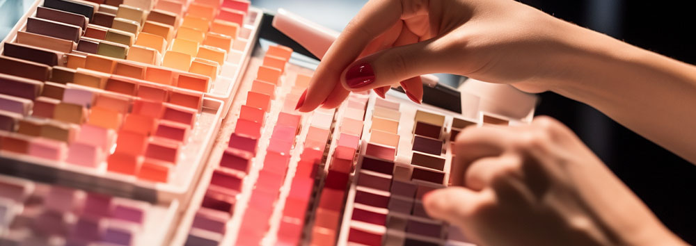
Creating a consistent color palette that resonates with your audience is the key to building a successful beauty brand. Expertly crafted color schemes evoke emotions and captivate the senses. A well-designed palette can make or break a brand, which makes understanding color psychology all the more important.
Color scheme psychology plays a crucial role in any branding strategy. It should be about choosing hues that align with your message and values. For example, if you’re marketing an eco-friendly product, you might choose shades of green to convey sustainability and nature. Alternatively, metallic colors like gold or silver could create a sense of luxury and sophistication.
Remember how different colors impact consumers’ subconscious thoughts and emotions when designing your logo. Red is often associated with passion and energy, while blue conveys trustworthiness and reliability. Yellow invokes happiness and optimism, while purple suggests creativity and imagination.
Build Consistency
To build consistency into your brand’s color palette, select a primary color as the anchor for everything else. This hue should reflect your overall aesthetic and be the foundation for all other design elements. From there, consider complementary colors that pair well with your primary shade – these are great options for accents on the packaging or web designs.
Remember: consistency builds credibility! Once you’ve established your brand’s core visual identity through its color palette, stick with it across all touchpoints (from social media graphics to packaging). Your customers will appreciate being able to recognize your products instantly – it creates loyalty and fosters trust between customer and brand.
Nested Bullet Point List
- How to Choose Your Primary Color
- Consider the emotional associations people have with certain hues
- Think about what colors complement each other nicely
- Tips for Building Consistency Into Your Palette
- Create a style guide that outlines your brand’s color palette and how it should be used.
- Use tools like Adobe Color or Coolors to help you choose colors that work well together.
Building a consistent color palette creates an instantly recognizable visual identity for your beauty brand. Customers will associate these hues with your products, which can lead to increased sales and customer loyalty. Understanding color psychology in logo design is key to crafting a successful branding strategy. With careful consideration and planning, you’ll be on your way to creating a beautiful and cohesive aesthetic for your brand without fear of inconsistency in the future!
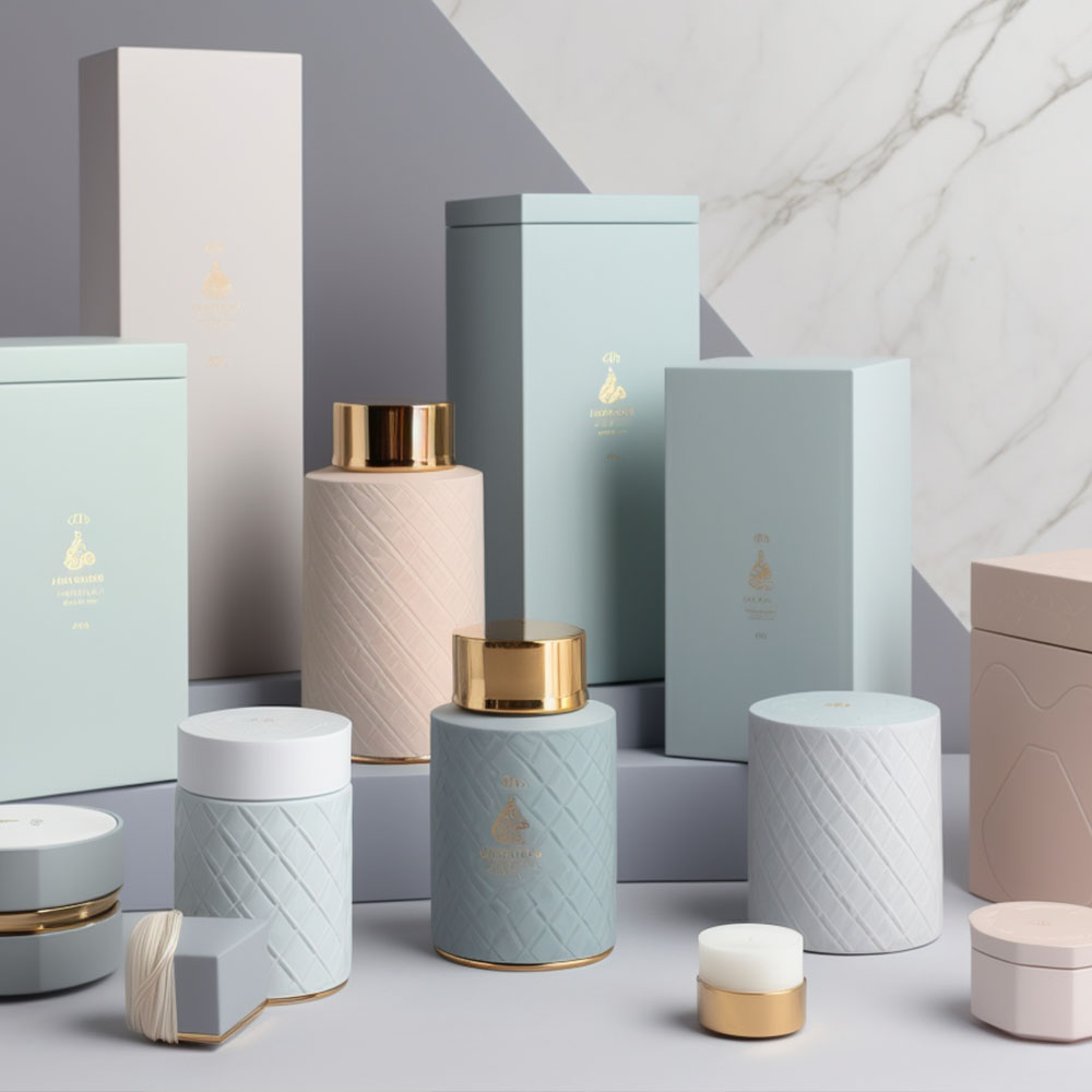
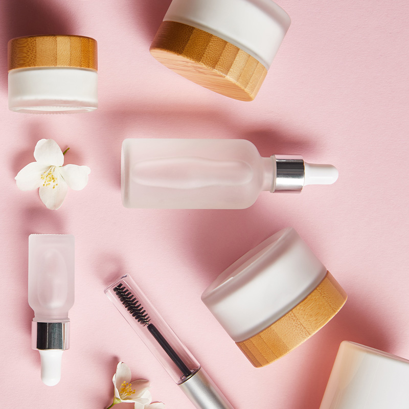
The Importance Of Packaging Design
Packaging design plays a crucial role in the branding of beauty products. It is the first point of interaction between consumers and brands, making it essential to create an impactful experience that resonates with them. A well-designed package can attract attention and convey key brand messages effectively.
Sustainability in packaging design has become increasingly important for environmentally conscious consumers. Brands must incorporate eco-friendly materials into their packaging without compromising quality or aesthetics. Using biodegradable materials such as bamboo, recycled paper, or glass bottles can help reduce waste and promote sustainability.
Customizing packaging for different products can significantly enhance the consumer’s overall experience. For instance, skincare products may require specific packaging designs that protect the ingredients from light exposure, while makeup products require more glamorous designs. By understanding the needs of each product category and tailoring the packaging accordingly, brands can improve customer satisfaction levels.
Packaging design is imperative for creating memorable experiences that resonate with consumers. Incorporating sustainable practices in designing packages helps minimize environmental impact while customizing them enhances user experience. In essence, by putting thought into every aspect of branding – including packaging – companies can establish themselves as industry leaders committed to innovation and sustainability.
Leveraging Colors In Social Media Campaigns
Moving forward, it is crucial for beauty branding to capitalize on the power of colors in social media campaigns. It’s no secret that social media has become an integral part of marketing strategies, and leveraging color psychology can help brands stand out from competitors. One technique to consider is utilizing color contrast in your posts. This means using complementary or contrasting hues to attract attention and create a visually stimulating feed.
Color psychology plays a vital role in influencer marketing as well. When partnering with influencers, ensure their aesthetic aligns with your brand’s color scheme and values. Doing so will effectively communicate your message through their sponsored content while creating consistency across all platforms.
Furthermore, it’s important to note that different social media platforms have unique audiences and require varying approaches when it comes to color usage. For example, Instagram users respond better to bright and bold tones, while Pinterest users prefer muted shades. Understanding these nuances will allow you to tailor your strategy accordingly.
Incorporating color psychology into social media campaigns can significantly impact engagement rates and drive conversions. Whether through the use of color contrast or a careful selection of influencers who align with your brand’s aesthetic values, various techniques are available for successful implementation. As always, keep experimenting with new ideas and stay open-minded about evolving trends to remain at the forefront of innovation within the industry.
Creating A Strong Brand Identity
When crafting a solid brand identity, developing a brand personality that speaks to your target audience is important. This can be done by carefully crafting a visual identity that reflects your brand’s core values. Leveraging the science of color psychology is key to making your brand stand out. Colors evoke deep emotions in people and can be used to create strong connections with customers. You can create a powerful visual identity by understanding how the different hues affect how people perceive your brand. With the right combination of colors, you can make your brand stand out and draw attention to your products and services. With a little knowledge of color psychology and an eye for design, you can create a strong brand identity that stands out in the beauty market.
Developing A Brand Personality with Color Psychology
I understand the importance of developing a brand personality. Your brand’s messaging should be consistent with your business goals and values while resonating with your target audience. Brand messaging is crucial because it creates an emotional connection between your customers and your products.
You must first conduct a thorough target audience analysis to develop a strong brand identity. This will help you identify who your ideal customer is and what they value in terms of lifestyle, beliefs, and preferences. Once you have this information, you can create a brand personality that aligns with their needs and desires.
Your brand’s personality should reflect its unique qualities while still appealing to your target audience. For example, if you’re targeting millennials who prioritize eco-friendliness, using sustainable materials in packaging or supporting environmental causes could be part of your brand personality. Creating a memorable character for your brand will make it more relatable to consumers.
In conclusion, developing a strong brand personality requires careful planning and execution based on target audience research. By crafting messages that resonate with them emotionally through thoughtful consideration of colors used in marketing collateral or other design elements invoking certain emotions like calmness from blue hues or passion from red tones – companies can connect better than ever!
Crafting A Visual Identity
Now that we’ve discussed the importance of brand messaging and personality, let’s move on to crafting a visual identity. As a beauty branding expert, I understand how crucial it is to have a compelling visual identity that memorably represents your brand.
Your visual identity includes anything from your logo design, typography choices, color palette, and overall aesthetic. This plays a significant role in how consumers perceive your brand and can influence their purchasing decisions. Understanding consumer preferences and cultural influences is vital when creating a visual identity that resonates with them emotionally.
Color psychology plays a major role in developing a successful visual identity. Different colors evoke various emotions and associations, so choosing the right hues for your brand is essential. For example, blue conveys trustworthiness and reliability, while red signifies passion and excitement. Incorporating these colors into your marketing collateral or packaging design can create an immediate emotional connection with your target audience.
Typography also plays a critical role in crafting a strong visual identity. The font styles used in your logo or website should be easy to read yet visually appealing. It should match your tone of voice throughout your brand messaging to create consistency across different platforms.
In summary, creating a strong visual identity requires careful consideration of many factors, such as color psychology, typography choices, and overall aesthetics. These elements must align with your brand’s values while resonating emotionally with your target audience. A well-crafted visual identity will leave lasting impressions on consumers’ minds long after interacting with your products or services.
Leveraging Color Psychology
Now that we’ve covered the importance of crafting a strong visual identity, let’s delve deeper into one critical aspect: leveraging color psychology. As a beauty branding expert, I understand the importance of choosing the right hues for your brand, as they evoke different emotions and associations.
Color symbolism varies across cultures, so understanding cultural influences is vital when choosing colors for your brand. For example, in Western culture, white represents purity and innocence, while in Eastern cultures, it signifies mourning or death. By knowing these nuances, you can decide which colors will best represent your brand values while emotionally resonating with your target audience.
Consider their psychological effects when incorporating colors into your brand’s visual identity. Blue conveys trustworthiness and reliability, while red signifies passion and excitement. Green embodies growth and nature, while yellow evokes happiness and optimism. Remember that colors don’t have to be limited to logos or packaging; using them consistently across all aspects of your brand messaging can create an emotional connection with consumers.
The use of color psychology in creating a strong brand identity extends beyond just choosing the right hues; it involves understanding how these colors work together to convey a cohesive message. Colors should complement each other without clashing or overwhelming the viewer. A well-crafted visual identity uses colors strategically to capture attention, communicate brand values effectively, and leave lasting impressions on consumers’ minds long after interacting with your products or services.
In conclusion, leveraging color psychology is key when creating a strong brand identity that emotionally resonates with your target audience. Understanding cultural influences and color symbolism helps decide which shades best represent your brand values. Incorporate these carefully chosen colors consistently throughout your marketing collateral to create a memorable impression on viewers.
Measuring The Success Of Your Color Strategy
As a beauty brand, it’s important to understand how color can impact your consumer’s emotions and ultimately drive sales. However, simply choosing colors based on intuition or personal preference may not be enough to guarantee success. That’s where measuring effectiveness and tracking progress come into play.
One way to measure the effectiveness of your color strategy is through consumer research. Conducting surveys or focus groups can provide valuable insights into how consumers perceive your brand’s colors and whether they align with your intended message. This information can help you make informed decisions about adjusting or refining your color palette.
Another method for measuring success is through data analysis. Tracking metrics such as website traffic, social media engagement, and sales numbers before and after implementing a new color strategy can help you determine its impact on overall performance. By setting clear goals and regularly monitoring these metrics, you can gauge the effectiveness of your color choices.
It’s also important to remember that measuring your color strategy’s success should be ongoing. As trends and consumer preferences change over time, so too may the impact of certain colors on your target audience. Regularly assessing and adapting your approach will ensure continued success for your brand.
By prioritizing measurement and tracking progress, beauty brands can confidently choose colors that resonate with their target audience while achieving business objectives simultaneously – all without relying solely on guesswork or instinctual decision-making.
Color Psychology Conclusion
Color Psychology is fascinating. The way we perceive different hues can have a significant impact on our emotions and behavior. However, it’s ironic how consumers often purchase based on packaging design rather than product quality.
But fear not, my fellow marketers! Using the right colors in your branding strategy can create an emotional connection with your audience and increase brand recognition. Remember to experiment with bold and subtle shades, use color combinations wisely, and always keep your target audience in mind. With these tips and techniques, you’ll be able to create a strong brand identity that resonates with customers for years to come.
Read more of our blog posts to learn more about starting your business!